Four projects, one product surface: credit and lending, a brand-new marketplace, a loyalty program, and the design-system work now underway to keep all of it consistent. Each starts from a different constraint, but the throughline is the same. Write it once, get it right in both languages, and build it so the next person doesn't start from scratch. (K.ai, Klivvr's AI assistant, now has its own standalone case study →.)
Credit & Loans: Making Complex Finance Approachable
Credit is Klivvr's most high-stakes feature. The copy has to guide someone through applying for a credit limit, understanding installments, and recovering from a rejection or a blocked state, all while staying accurate enough to survive legal and compliance review.
The Challenge
Financial terms don't translate cleanly into conversational Arabic, and every string touches regulation. The team needed copy a first-time borrower could understand instantly, in two languages, without softening it into something legally imprecise. That held true across application, activation, refund, and Family Credit sharing flows.
Key Decisions
One term, no exceptions
Locked one Arabic term as the only accepted phrase for "credit limit," never a looser alternative. It's enforced across every screen and every knowledge base entry, including K.ai's.
Blocked states tell you why
Every blocked or rejected state names the specific reason and the next step, instead of a generic "something went wrong."
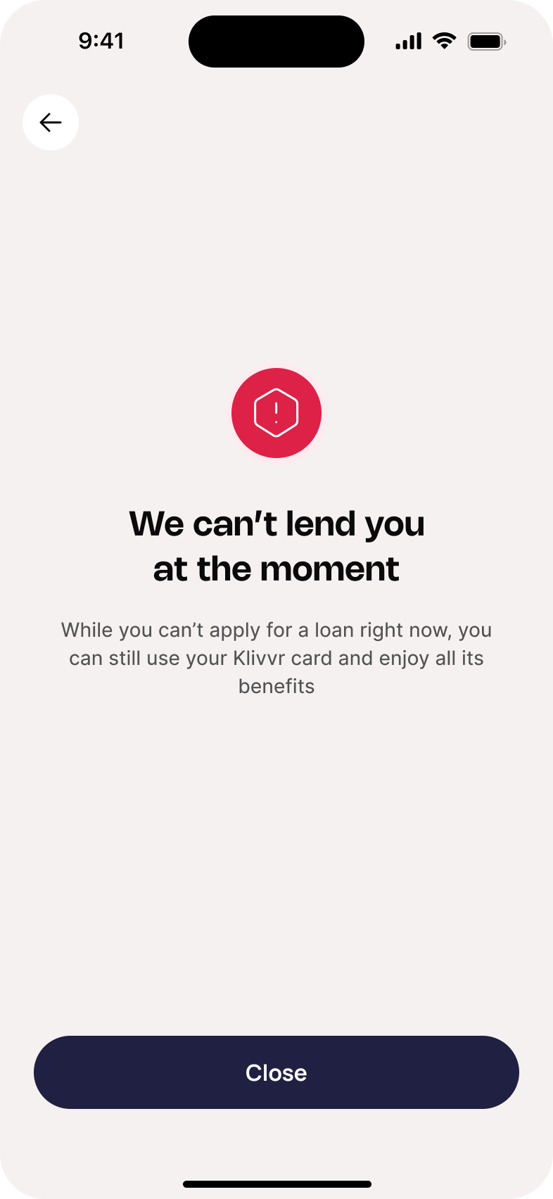
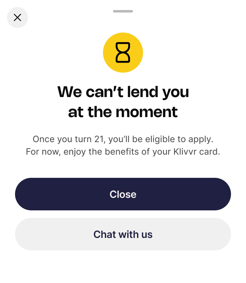
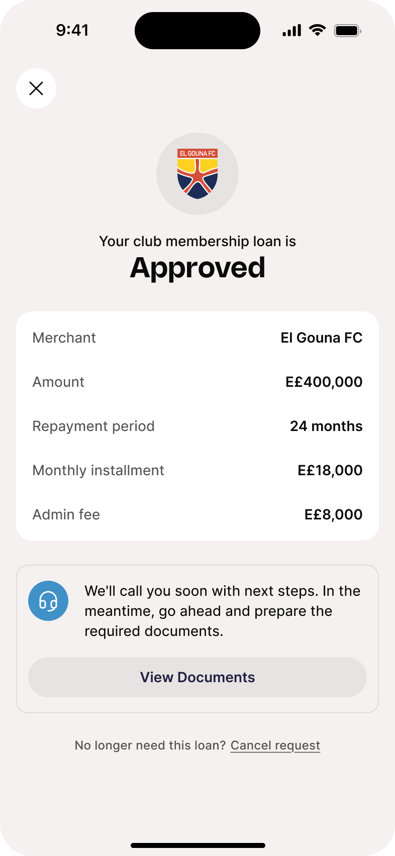
And when a loan is approved, the confirmation states the same kind of facts: merchant, amount, repayment period, in plain language instead of banking-speak.
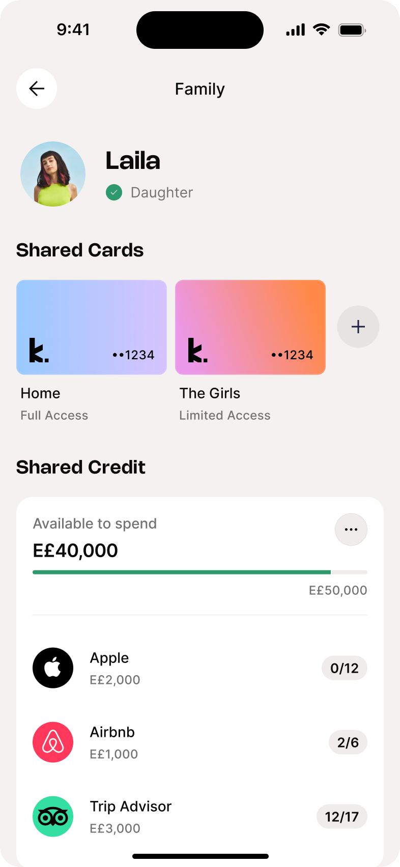
Family Credit sharing
Designed copy for credit-holder-initiated sharing, distinguishing "pending verification" from "waiting on recipient," a distinction the original flow conflated.
Refund decision flow
Wrote the explainer and success/blocked copy for refund decisions in plain language, while keeping the legal specifics intact for compliance sign-off.
Outcomes
- 10+ flow states fully localized end to end
- Both languages held to one shared glossary
- The blocked-state pattern is now reused by other teams shipping financial features
Reflection
Credit copy is where clarity and compliance have to survive the same sentence. I learned to treat every financial term as a fixed asset, not a stylistic choice. One wrong synonym in Arabic can change what a user believes they agreed to.
K.Shop: Content for a New In-App Marketplace
K.Shop (originally named Marketplace) lets Klivvr users spend their credit limit and K.Points at partner merchants. I owned the copy from initial naming decisions through a full localization pass and a standalone knowledge base.
The Challenge
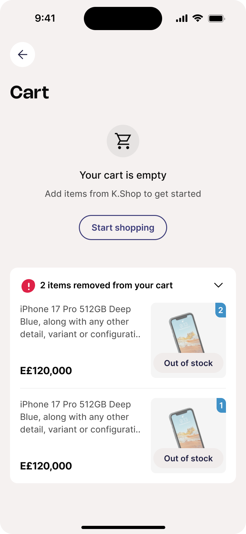
A brand-new feature meant no existing terminology to lean on. Every screen, state, and edge case needed copy decided from scratch, in two languages, across cart, checkout, order tracking, saved addresses, and out-of-stock states, while staying consistent through a mid-project rename (Marketplace → K.Shop).
Key Decisions
Renaming ripple effect
When the feature was renamed to K.Shop, I audited every string and localization key so the change didn't leave stale references for developers.
Empty states as a system
Rather than write each empty state as it came up, I grouped them by cause and matched each group to its own copy pattern and CTA logic. That's the framework I later generalized company-wide in the Content Componentization case study below.
Order states told plainly
Cart, checkout, and order tracking copy always states what happened and what's next, never a bare status label.
52-entry bilingual knowledge base
Built a standalone K.ai knowledge base for K.Shop questions, correcting outdated canned responses using real Figma screenshots as ground truth.
Outcomes
- 15+ screens fully localized, EN + AR
- 52 bilingual knowledge base entries
- The 4-category empty-state framework is now a reusable pattern other teams pull from
Reflection
K.Shop showed me that naming is content strategy, not marketing's job alone. A rename touches every string, every key, every knowledge base entry. Someone has to own that consistency end to end.
K.Points: Turning a Loyalty Ledger Into a Reason to Come Back
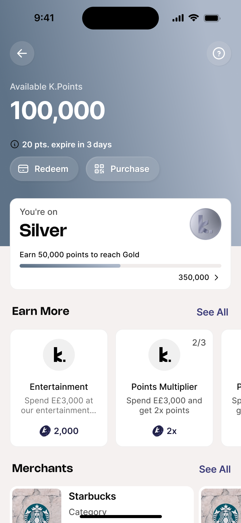
K.Points is Klivvr's rewards currency, earned through challenges and streaks. Left unattended, this kind of feature reads like a banking ledger. My job was to make it feel like a reward worth chasing, in a voice that stayed warm in both languages.
The Challenge
Five different challenge mechanics: cashback, multiplier, family, repeated, and total. Each needed its own description template, plus copy for streaks, Spin the Wheel, and Mystery Box rewards, all while avoiding language that felt transactional or clinical.
Key Decisions
Reward voice, not banking voice
Replaced transactional phrasing like "One-time voucher" with warmer alternatives, cutting words like "transacting" that felt too formal for a rewards screen.
"Active on" over "Scheduled"
Renamed challenge availability labeling to read like a feature, not a system status.
CTA pairing
Landed on "Join & Earn" after multiple rounds. It reads as an invitation, not an instruction.
Streak nudges, correctly placed
Moved streak-related nudges off the reward confirmation screen, where they competed with the reward itself, to where they'd actually motivate a return visit.
Outcomes
- 5 challenge mechanics, each with its own copy template
- 2 full reward screens shipped EN + AR (Spin the Wheel, Mystery Box)
- The challenge-mechanic naming pattern is now documented as a design system standard
Reflection
Working on K.Points showed me that loyalty copy is really motivation design. Every label is either pulling someone back into the app or quietly pushing them out. There's no neutral option.
Content Componentization
Klivvr's UI copy was being written screen by screen, meaning the same kind of decision, like how an empty state should read or how an error should apologize (or not), got made differently by whoever touched it last. This project documents those patterns once, bilingually, inside the design system itself.
The Problem
Without a shared reference, UI copy patterns drift: two error messages that should feel the same read differently, empty states get invented from scratch each time, and Arabic conventions live only in individual designers' memory.
Approach So Far
Categorize before writing
Empty states split into four types, each with its own copy logic and CTA pattern.
Document expected behavior, not just copy
Each component entry states the rule behind the copy, like field-error thresholds, so the next person applies the logic correctly, not just the wording.
Bilingual from the start
Every entry ships with EN and AR guidance together, flagged for native-speaker review before handoff.
Embedded where the work happens
Living inside the Figma design system next to the components themselves, instead of a separate doc that goes stale.
Where It Stands
Empty, error, success, and loading states are being documented as one reusable bilingual library, with a target of 80% coverage across core in-app strings.
Why This Matters
This is content strategy at the systems level, not the screen level. Instead of writing an empty state, I'm deciding how every empty state at Klivvr should be written, and building that decision into the tool where design actually happens.